

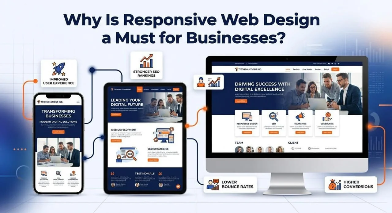
Responsive web design is a must for businesses because most of your customers are browsing on mobile phones, and a site that does not adjust to their screen loses their trust within seconds. A responsive website automatically reshapes its layout, images, and text for any device, which means better user experience, stronger SEO rankings, lower bounce rates, and more conversions for your business, without the extra cost of building separate mobile and desktop versions.
If you have ever opened a website on your phone and had to pinch, zoom, and scroll sideways just to read a sentence, you already understand the problem responsive design solves. Today, a business website is often the very first impression a customer forms about a brand, and that impression is being formed on a small glass screen more often than on a laptop. This blog breaks down exactly why responsive web design for business is no longer optional, what it actually involves, and how it affects everything from your Google ranking to your monthly revenue.
What Is Responsive Web Design and How Does It Work?
Responsive web design is a development approach that uses flexible grids, scalable images, and CSS media queries so a single website automatically adjusts its layout to fit any screen size, from a small smartphone to a large desktop monitor.
Instead of building one fixed layout for desktop and hoping mobile users can manage, responsive design works by detecting the width of the visitor’s screen and rearranging the page elements accordingly. A three-column layout on a desktop might become a single stacked column on a phone, buttons grow larger for easier tapping, and images resize so nothing gets cut off or stretched. This is achieved through three core building blocks that we cover in the next section.
The Core Principles of Responsive Web Design
There are three technical pillars that make responsive design possible, and understanding them helps you have a smarter conversation with your web development team.
Fluid grids that use relative units like percentages instead of fixed pixels, so the layout stretches and shrinks naturally with the screen Flexible images and media that scale within their containing element, so a photo never spills outside its box or becomes pixelated CSS media queries that apply different styling rules based on screen width, allowing the same HTML to look completely different on a phone versus a monitor
When these three elements work together, your website essentially becomes shape-shifting, adjusting itself in real time no matter what device a visitor pulls it up on.
Why Does Responsive Design Matter So Much for Businesses Today?
Responsive design matters because mobile devices now generate the majority of web traffic worldwide, and businesses that ignore this reality are actively pushing away a large share of their potential customers before those visitors even see what the business offers.
Think about your own daily habits for a moment. You check emails on your phone during a commute, compare product prices while standing in a store, and search for a nearby service while walking down the street. Your customers behave exactly the same way, and every one of those moments is a make-or-break opportunity for your business. If your site loads broken or clunky on their phone, they simply move to a competitor whose site works properly, and that decision often takes less than five seconds.
What Percentage of Web Traffic Is Mobile in 2026?
Mobile devices account for well over half of all global website traffic in 2026, and for many industries like retail, food, and local services, mobile visits make up an even larger share of total visitors.
This shift has been building for over a decade, but it has now become the default rather than the exception. Businesses that still design “desktop first and mobile as an afterthought” are essentially designing for a shrinking minority of their audience while neglecting the majority. This is precisely why website design trends 2026 are leaning even harder into mobile-first thinking, voice search compatibility, and faster-loading responsive frameworks.
What Are the Real Benefits of Responsive Design for a Business?
The benefits of responsive design include a better user experience, improved SEO rankings, lower bounce rates, higher conversion rates, easier website maintenance, and long-term cost savings compared to running separate mobile and desktop sites.
Let us break these benefits down individually, because each one has a direct and measurable impact on how your business performs online.
Better user experience across every device, which builds trust and keeps visitors engaged longer on your pages Stronger SEO rankings, since Google now uses mobile-first indexing to rank websites, meaning your mobile experience directly determines your search visibility Lower bounce rates, because visitors no longer leave in frustration when a page fails to load or display correctly Higher conversion rates, as a smooth checkout or contact form on mobile means fewer abandoned carts and fewer lost leads One website to manage instead of two, which saves your team time, money, and ongoing development headaches Faster page speed on modern responsive frameworks, which further supports both rankings and user satisfaction
How Does Responsive Websites Affect SEO Ranking?
Responsive websites affect SEO ranking directly because Google crawls and indexes the mobile version of your site first, so a poor or non-existent mobile experience can lower your rankings even if your desktop site looks perfect.
Google made mobile-first indexing the standard practice years ago, and it remains central to how search rankings are calculated today. This means the search engine is essentially judging your business by your mobile site, not your desktop one. A responsive website ensures both versions are actually the same site with the same content, so there is no risk of Google indexing a stripped-down or broken mobile page. On top of that, faster loading responsive pages tend to have better Core Web Vitals scores, which is another ranking factor Google actively considers.
How Does Website Bounce Rate and Responsive Design Connect?
Website bounce rate and responsive design are closely connected because visitors who struggle to read, navigate, or click on a poorly formatted mobile page will leave almost immediately, and a high bounce rate signals to Google that your site is not meeting user needs.
A bounce happens the moment someone lands on your page and leaves without taking any further action. On a non-responsive site, this often happens within seconds because the visitor cannot even read the text without zooming in manually. Responsive design removes that friction entirely, keeping visitors on the page long enough to actually read your offer, browse your products, or fill out your contact form.
Is Responsive Design Worth the Cost for Small and Growing Businesses?
Yes, responsive design is worth the cost for small and growing businesses because it eliminates the need to build and maintain a separate mobile site, and the long-term savings in development time and lost customers far outweigh the upfront investment.

How Much Does It Cost to Make a Website Responsive?
The cost of making a website responsive varies depending on the size of the site, the complexity of its features, and whether you are building fresh or converting an existing non-responsive site, but it is almost always cheaper than building and maintaining two separate websites long term.
A simple business website with a handful of pages will cost far less to make responsive than a large eCommerce store with hundreds of product pages and custom checkout flows. That said, the responsive design cost benefit calculation almost always favors the investment, because a single responsive site avoids the double expense of designing, testing, and updating two completely separate platforms every time your business changes something. Many web development agencies, including teams that specialize in frontend development services, can assess your current site and give you an accurate quote based on your specific pages and functionality.
What Are the Benefits of Responsive Design for Small Business Owners Specifically?
For small business owners, responsive design means a single budget-friendly website reaches every customer regardless of device, competes credibly against larger businesses, and requires only one set of ongoing maintenance and content updates.
Small businesses often operate with tighter marketing budgets than large corporations, which makes efficiency essential. A responsive site lets a small business look just as professional and functional as a much bigger competitor, without needing separate teams or budgets for mobile app development. It also means that when you update a price, add a new service, or change your contact number, you only need to make that change once instead of updating multiple platforms.
Responsive Design vs Mobile App for Business: Which One Do You Actually Need?
For most businesses, responsive web design is the smarter first investment compared to a mobile app, because it reaches every visitor instantly through a browser without requiring a download, while a mobile app is better suited for businesses that need offline access, push notifications, or frequent repeat engagement.
This is one of the most common questions business owners ask when planning their digital presence. A mobile app requires users to actively search for it, download it, and grant it space on their phone before they ever see your content, and many people simply will not take that extra step for a business they are exploring for the first time. A responsive website, on the other hand, works instantly the moment someone clicks a link from Google, social media, or an ad. For most service-based businesses, retail stores, and startups, a responsive website should come first, with a mobile app considered later only if there is a clear ongoing need for it.
How Do I Know If My Website Is Responsive?
You can know if your website is responsive by resizing your browser window on a desktop to see if the layout adjusts smoothly, or by using a free tool like Google’s Mobile-Friendly Test, which instantly checks your site and flags any mobile usability issues.
What Tools Test If a Website Is Responsive?
The most reliable tools to test if a website is responsive include Google’s Mobile-Friendly Test, Chrome DevTools’ device toolbar, and Google Search Console’s mobile usability report, all of which are free and take only a few minutes to run.
Running these checks regularly is a smart habit, because a website that was responsive when it launched can quietly break over time as new plugins, images, or sections get added without proper testing. If you notice text overlapping, buttons too small to tap, or horizontal scrolling on mobile, those are all clear signs your website needs a responsive redesign sooner rather than later.
Signs Your Website Needs a Responsive Redesign
If you are still unsure whether your business site needs attention, watch for these warning signs.
Visitors have to pinch and zoom to read any text on their phone Buttons and links are too close together, making accidental taps common Images are cut off, stretched, or overflow outside their containers Your bounce rate has been climbing steadily over recent months Your site takes noticeably longer to load on mobile data compared to Wi-Fi A recent Google Search Console report has flagged mobile usability errors
How Does Site Speed Relate to Responsive Design?
Site speed and responsive design are closely linked because a well-built responsive site uses optimized, flexible images and efficient code that load faster across all devices, while a poorly coded or non-responsive site tends to load unnecessarily large files that slow down mobile performance dramatically.
Speed is not a separate concern from responsiveness, it is actually built into good responsive design practice. When images and elements are properly sized for the device requesting them, the browser does not waste time downloading a massive desktop-sized image for a small phone screen. This directly affects Google’s Core Web Vitals scores, which measure loading speed, interactivity, and visual stability, all of which influence both your ranking and how long visitors stay on your site before giving up and leaving.
Conclusion
At the end of the day, responsive web design is not a trend, it is simply how the modern internet works. Your customers are browsing from phones, tablets, and laptops within the same afternoon, and your website needs to keep up with them seamlessly on every single device. Businesses that invest in a properly built responsive site tend to see the payoff in real numbers, longer time spent on site, more inquiries, more sales, and stronger search visibility over time.
If your current website is showing any of the warning signs mentioned above, it may be time for a professional evaluation. Adlivetech, a Faridabad-based IT and digital marketing company with experience serving businesses, startups, and entrepreneurs across multiple industries, offers responsive web design, custom web development, and frontend development services in Faridabad built around real business goals rather than templates. Their team can review your existing site, point out exactly where it is losing mobile visitors, and build a responsive solution that fits both your budget and your growth plans.
Frequently Asked Questions
1. Does adaptive design work the same way as responsive design?
No, adaptive design uses a set of fixed layouts built for specific screen sizes, while responsive design uses one flexible layout that adjusts continuously to any screen width. Responsive design is generally considered more future-proof, since it does not need a new fixed layout every time a new device size becomes popular.
2. Can an old website be converted into a responsive one, or does it need a full rebuild?
In many cases, an older website can be converted to responsive design without a complete rebuild, especially if the underlying code structure is reasonably modern. However, very old or heavily customized sites sometimes require a partial or full rebuild to properly support fluid grids and media queries.
3. Will making my website responsive automatically improve my search rankings?
Responsive design alone will not guarantee a top ranking, but it removes a major obstacle that was likely holding your rankings back, since Google prioritizes mobile-friendly sites in its indexing process. Pairing responsive design with solid SEO content and fast page speed gives you the best combined result.
4. How long does it typically take to build a responsive business website?
A straightforward small business website can often be completed in a few weeks, while a larger eCommerce or feature-heavy site may take longer depending on the number of pages and integrations involved. Your development team should be able to give you a clear timeline once they understand your specific requirements.
5. Do responsive websites work well for eCommerce stores with many product pages?
Yes, responsive design is especially important for eCommerce stores, since a large share of online shopping now happens on mobile phones, and a smooth mobile checkout experience directly affects sales. A responsive eCommerce site ensures product images, filters, and the checkout process all work cleanly regardless of screen size.